
I feel absolutely ridiculous doing it, but referencing photographs of famous people is a fairly decent way to practice doing portraits. The advantages: they are readily available via a quick Google Images search; they are recognizable faces, so people can tell how well (or badly) you've managed to capture the person's likeness without having to actually know the person; you don't have to wait for your friends to give you reference photos to work off of; and nobody is offended if you do a bad job. The disadvantages are that sometimes the photos are a little too perfect to make a decent painting from, and of course that if you're anything like me you feel ridiculous doing them. But I really want to be good at portraits, and there are only so many usable photos that my friends send me. So I decided to do some value studies using famous faces as references.
I did the first couple of these alongside my monochrome landscape studies with the same intention: to get better at gauging values (the lightness or darkness of the colors in a picture), but right off the bat I found that I still have some trouble with likenesses. I can't even tell how bad of a likeness this one is (it's supposed to be Will Smith) because I'm too close to it, but it certainly doesn't capture the expression the way I wanted to. The values here actually aren't terrible though. I can't remember whether or not I "cheated" by turning the reference photo into a black-and-white image too. On some of these I did; on others I stuck with my primary intention of learning to get my values right while looking at a full-color image.

For my next one I tried a reference photo with a much more obvious expression. I think that helped make the photo recognizable (at least to anyone who watches Community), but in all honesty this isn't a very good portrait. The values are boring and inaccurate and it's pretty sloppy. That said, it's not exactly embarrassingly bad, either.

I decided to try using the same reference photo again with a different style, going back to my cartoon roots. I actually like the result a lot better as a standalone image, but it's not much of a likeness--this could be anyone. Except for the expression, it looks more like a doll than a person.

This one is neither a good likeness nor a good image. The head is lopsided, the values are splotchy and off, and it's just awkward to look at. Since I'm such a perfectionist, I decided to redo this one as well.

Obviously a lot better, but honestly that's mostly because I started out by just tracing the source image. Not surprisingly, I don't have a lot of experience painting heads at this angle, so I just wanted to see what it would look like to get it right. Tracing may seem like cheating, but you'd be surprised how many professional artists use tracing in their images; contemporary photorealists often trace from a projector, and even the old master Vermeer used a fancy light-box to project the outlines of his subjects onto the canvas so he could trace them.

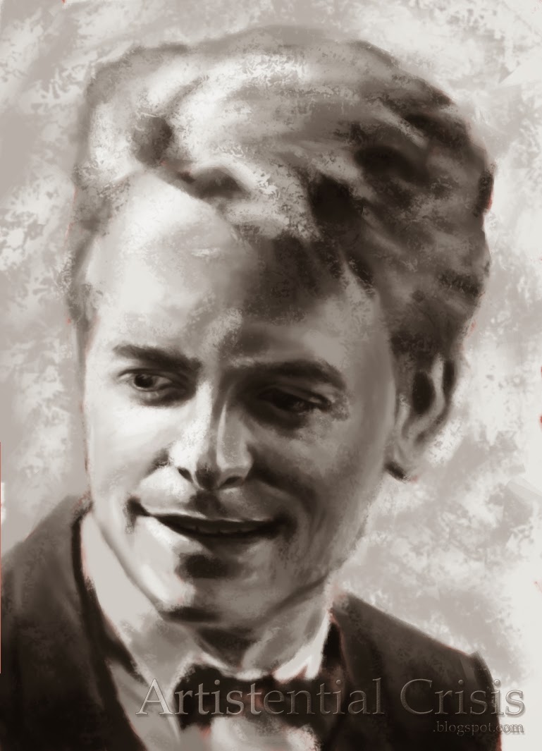
With this one I felt like I was finally starting to get it. (It's also where I started using a fancy brush I created; more about that in a different post.) I still wasn't quite there though; the above image is what I got from just eyeballing it...

...And this one is after I cheated a little and used the eyedropper tool to check my work against the values in the original photo. If you look closely you'll see that I lightened the cheek and the forehead, which made the head a bit more three-dimensional and natural. I learned from my cheating though; it's like checking the answers at the end of a math book, but only after you have tried your best to work it out yourself.

Okay, maybe I didn't learn that much. This is probably my worst one. It's... just awkward for so many reasons. The philtrum (the little divot on the upper lip) is waaaaay too dark, the proportions are totally off, the expression is weird... Just, let's forget about this one and move on, please.

This one better displays the lessons I learned from the Donald Glover image, but her eyes are a little far apart and I feel weird about it.

This is the first image I felt really good about without having to cheat. It probably helps that it's a profile rather than head-on or three-quarter view. It makes things a bit easier.
I'm also pretty satisfied with this one, but I had to cheat quite a bit for this one. Not for the values; I did a pretty good job with those. But the likeness was sooooo off. I had to use liquify, which is a Photoshop tool that lets you grab certain parts of the image and slide them around in a fluid way. This is what it looked like before I did that:

Just... no.
It doesn't even look like the right species.
* * *
The image on the top is the "culmination" of my black-and-white celebrity portraits. I used a grid to get the proportions right so that I wouldn't have to use the liquify tool again, so it's not like I was totally eyeballing it, but I felt satisfied. Maybe I should have waited until I had more than just a couple really good ones under my belt to go on to the next level (using color instead of just value), but to be honest at this point I was just bored with black and white. So, more on my color portraits later.